Elo Rank Study: How We Got to the Numbers
A step-by-step walkthrough of 21.6 million search results, from raw data to validated findings. Every filtering decision is shown transparently so you can evaluate each step.
Elo ranking was invented for chess. The core idea: every competitor starts at the same score. In our study, every business begins at 1,000 points. No advantages from brand size, category, or history. The only thing that matters is head-to-head performance.
Five coffee shops enter the ranking. Right now, they are all tied.
The principle: Elo measures sustained competitive performance through pairwise comparisons, not single snapshots. Over many matches, true competitive strength emerges.
When two businesses appear in the same search result, the one ranked higher wins the match. The winner gains points; the loser drops. In our system, we use a K-value of 32 and an expected-score scale of 400 — the same parameters used in competitive chess.
Starbucks outranks Dunkin’ in a local search. Both started at 1,000. Starbucks gains +16 points, Dunkin’ loses −16. When both competitors start at equal ratings, the point exchange is symmetric.
More matches follow. The field begins to spread.
This is where Elo gets interesting. When a lower-ranked business beats a higher-ranked one, the point swing is asymmetric. The upset winner gains significantly more points. The expected winner barely drops.
Local Brew (ranked near the bottom) outranks Starbucks (ranked first) in a search result. Local Brew gains +27 points because beating the top-ranked competitor is a strong signal. Starbucks loses only −5 points because one loss to a weaker competitor does not erase sustained performance.
Why this matters: Upsets carry more signal than expected wins. A small business consistently beating larger competitors climbs fast. A dominant business losing occasionally barely moves.
After thousands of matches, the rankings converge. Individual results still cause small fluctuations, but the overall order becomes stable. Businesses that consistently appear higher in search results accumulate an Elo advantage that reflects sustained performance, not a single lucky result.
In our study, each business participates in hundreds or thousands of pairwise comparisons across 21.6 million search results. The Elo scores we report reflect this entire competitive history.
Now you know how Elo works. The rest of this page walks through how we applied it: which data we used, how we filtered it, and what the numbers mean.
Do businesses that actively manage their digital presence rank higher in local search results?
We studied this using an Elo ranking system adapted from chess. Instead of measuring a single snapshot, Elo tracks sustained competitive performance: every time one business outranks another in a local search result, it gains rating points. Over millions of comparisons, persistent advantages become visible.
The managed cohort includes businesses with active Yext Listings (at minimum). But this group is diverse: some are new clients, some have been active for years. Some manage listings, reviews, and social media. Others focus only on listings. We are not controlling for strategy depth, tenure, or update frequency. This is an observational study, not a controlled experiment.
What this page does: Walk through every step from raw data to the filtered dataset the report will use, so each analytical decision is visible and auditable.
The Scout platform collected 21.6 million local search results across 30 industry categories and 7 sectors. Each result was scored through the Elo system and segmented by three dimensions: distance from the searcher, market competitiveness, and brand size.
The data spans four distance ranges. Headline finding: managed businesses rank +2.71 positions higher within 1 mile. The advantage is strongest at close range, where local competition is most direct and data management has the clearest impact.
21,632,851 total search results analyzed. Managed cohort: businesses with active Yext Listings. Unmanaged: all other businesses in the same competitive set.
At greater distances, the competitive field expands significantly. A search 5+ miles away returns results from many more businesses, making it harder to isolate individual performance signals.
Within 1 mile, proximity is controlled. The businesses appearing in these results are genuinely competing for the same local customer. This is where the impact of active data management is most clearly measurable.
The distance data confirms this: the managed-cohort advantage is +2.71 within 1 mile, drops to +1.26 at 1-3 miles, and shifts at 3-5 miles (-1.22) and 5+ miles (-0.57). This pattern reinforces that proximity is the dominant factor at distance, and that active data management is the differentiator when proximity is held constant.
All industry-level analysis from this point forward uses within-1-mile data only (1,826,571 results).
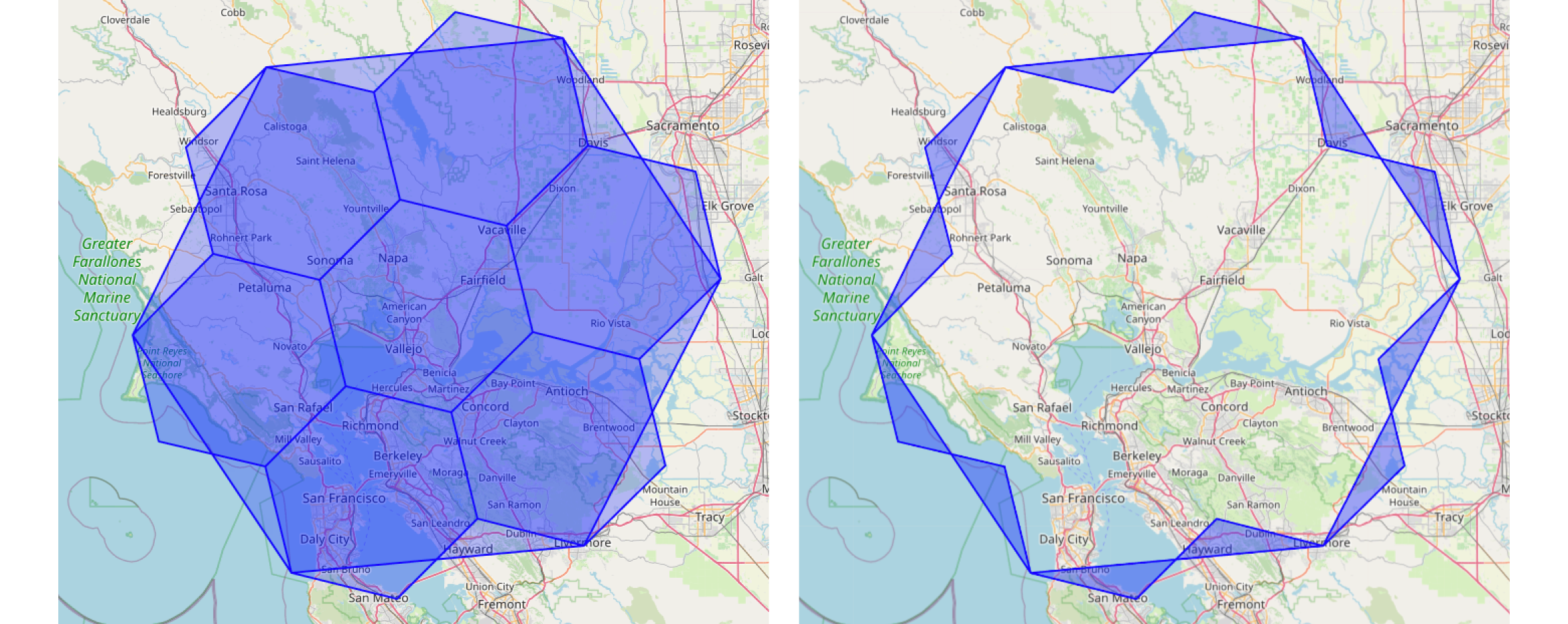
The distance bands in this study are measured from the centroid of an H3 hexagonal cell, not from a street address. Yext's Scout platform divides the Earth into hexagonal grid cells using Uber's open-source H3 system. Each cell at resolution 6 has an edge length of approximately 3.2 km.
Searches are conducted from the center point (centroid) of each hexagon. The distance from centroid to business listing determines which band it falls into. This approach provides uniform geographic coverage without the irregularities of ZIP codes or administrative boundaries.
Why hexagons? Unlike squares, hexagons have uniform distances to all neighbors. Every neighboring cell center is equidistant, eliminating the diagonal distortion of rectangular grids. Read the full methodology →
Within 1 mile, we have 30 industry categories across 7 sectors. The table shows every industry with its managed (Yext) and unmanaged observation counts, average Elo ranks, and the raw advantage.
Some numbers are striking. Medical Services shows a +7.21 advantage. Industrial shows +7.21. Auto Services shows +7.32. These are exciting, but to build confidence in them, we should look at how much data backs each number.
Industry-level averages are most meaningful when backed by substantial data. An industry with 8 managed observations can shift significantly based on a handful of businesses, so we want to identify where our confidence is highest.
The managed-cohort observation counts range from 0 (Retail/Coffee & Bakery) to 38,301 (Electronics & Tech). Six industries have fewer than 1,000 managed observations. Two have fewer than 50.
Consider Financial Advisory: 8 Yext observations vs 37 non-Yext. Or Grocery & Supermarkets: 12 vs 36. These are early-stage categories where the data will grow over time. For now, we can strengthen our analysis by applying a minimum sample size threshold.
The opportunity: By focusing on industries with robust sample sizes, we can present findings with the highest confidence. Smaller industries remain visible for context and future growth.
We require a minimum number of managed-cohort (Yext) observations for an industry to be included in the primary analysis. Industries below the threshold are shown for transparency but excluded from sector rollups and headline claims.
Choose a threshold to see how it affects the analysis. The visualization updates in real time.
Industries below the threshold are grayed out in the table. Their data is still visible, just clearly separated from the primary analysis.
Full transparency: every data point is shown. Industries with smaller samples tend to show more variation in their advantages, which is expected as those categories mature. The primary analysis focuses on industries where we have the strongest signal.
Among included industries, the majority show a clear managed-cohort advantage. The chart sorts industries by advantage to show the full spectrum.
The range reflects real variation across industries. Highly competitive, geographically clustered industries (like food service) show tighter margins, while industries with more varied competition (like healthcare and business services) show the largest advantages. This pattern makes intuitive sense: where competition is most localized, active data management has the greatest opportunity to differentiate.
Sector-level numbers are computed from included industries only. This means they may differ from the dashboard, which uses all industries regardless of sample size.
The sector view smooths out industry-level variation and shows the broader pattern. The advantage exists across most sectors but varies significantly in magnitude.
These dimensions use aggregate data across all industries. The sample sizes at every level are large enough (27K to 1.2M) that the threshold filtering used for industry analysis is not needed here.
Two patterns emerge. First, the managed-cohort advantage is largest in ultra-competitive markets (+6.20), exactly where you would expect data management to matter most. Second, small businesses benefit the most (+4.23), likely because managed data has a larger marginal impact on visibility when you are not already a well-known brand.
The Elo advantage correlates with measurable profile quality differences. Managed businesses have near-universal profile claiming (99.8% vs 77.9%), higher completeness, more reviews, and substantially more Google Posts activity.
These are correlates, not proven causes. We cannot say that claiming your profile causes higher Elo rank. But the pattern is consistent: the managed cohort's profiles are simply better maintained across every actionable metric.
Two metrics show no advantage: average star rating (essentially equal) and photo count (slightly lower for managed). Both are highly industry-specific and less directly tied to data management.
This is the validated dataset that forms the foundation of the published report. Every number has been through the sample-size filter. Every sector rollup uses only qualified industries.
What the report will use: The filtered industry results, sector rollups from qualified industries, aggregate distance/competitive/brand size data (no filtering needed), and profile quality metrics.
Areas for future study: controlling for client tenure, strategy depth (listings-only vs full platform), update frequency, and geographic concentration. The aggregate numbers in this study are conservative because they blend new and mature, active and passive clients within the managed cohort.
Each bar is one business, positioned by its average Elo rank (lower number = higher in search results). Managed listings (businesses using Yext) cluster toward better ranks. Unmanaged listings spread lower. The dots mark each group's mean rank; the green pill is the difference: managed businesses rank +2.71 positions higher on average within 1 mile.
Distance is measured from the centroid of each hexagonal cell to each business listing. Hexagons provide uniform neighbor distances, eliminating the diagonal distortion of rectangular grids.
Read the full H3 methodology →