
Website responsiveness is what customers have come to expect in this digital day and age. Most people don't wait until they're at home in front of the computer to find the answers to their burning questions. They use their watches, smartphones, laptops, or tablets.
Let's explore how to ensure your website is responsive enough to give your customers the information they need, regardless of what devices they are using.
The Evolution of Responsive Web Design
When the internet first became popular, there was no need for responsive web design since everyone was working with the same sized screen and even the same browser. Web designers could safely assume that whatever they were looking at would be represented in the same way to everyone who saw their pages since the general populace didn't have many options.
As the internet spread to cell phones, tablets, and other sized screens, web designers needed to adjust how they crafted their web pages. It wasn't until 2010 that an article was published using the phrase 'responsive web design' that people started to understand the growing need for web content that could automatically detect the user's settings and screen size and adjust accordingly.
How to Test Your Website for Responsive Web Design
Responsive web design is an important part of boosting user experience across all consumer devices. Essentially, you ensure that your website will load quickly and display the necessary information via the best format for the user's screen size. When you give your customers a great user experience across devices, you drive conversions and encourage them to become returning customers.
You also broaden your audience of potential customers when you optimize your website for any type of device. Some customers may only browse or shop through their tablets or smartphones, forgoing laptops entirely. Your website also needs to incorporate the ability to process taps from a stylus or touches alongside clicks from computer mice.
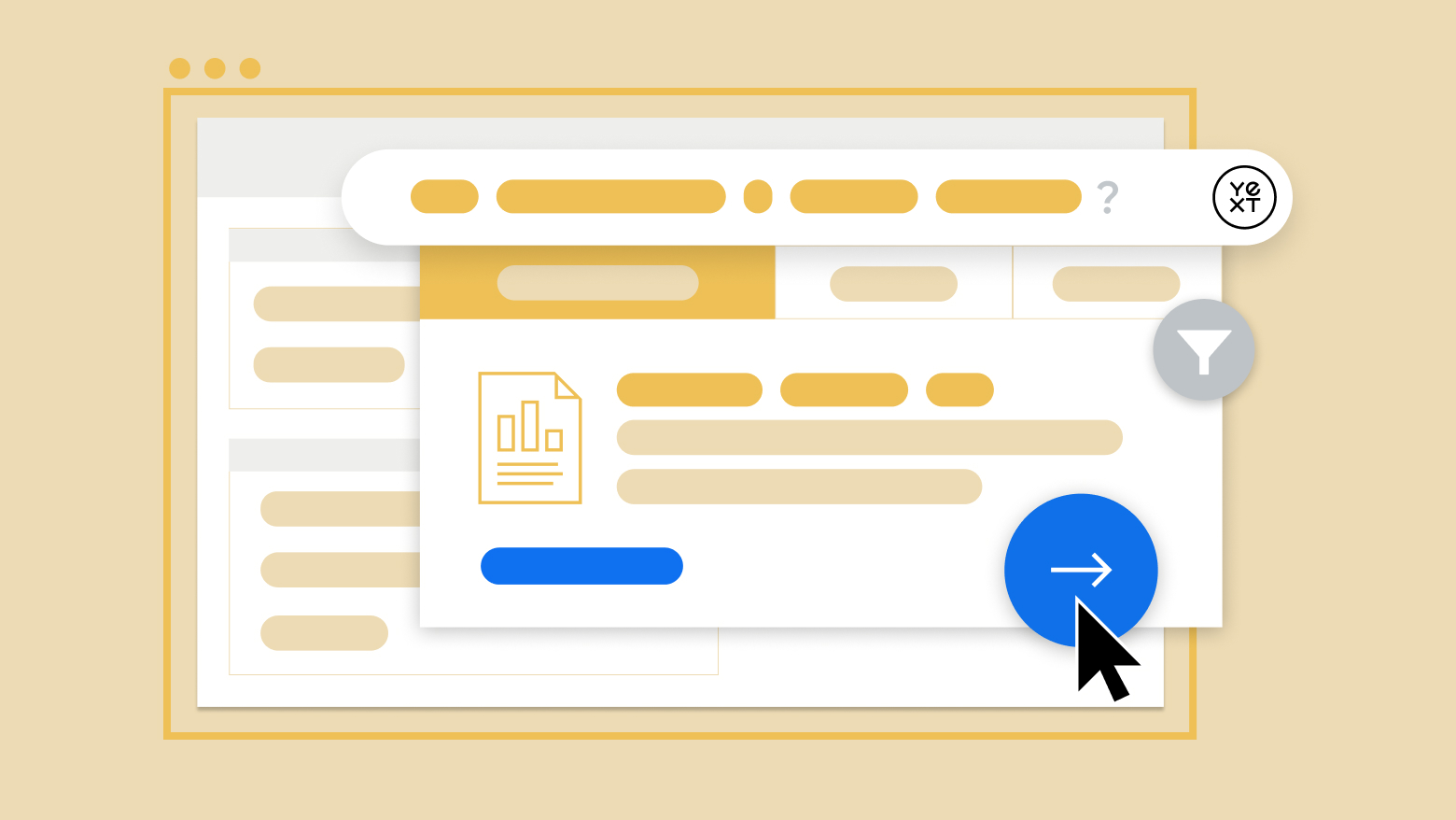
Consistent, fast-loading pages improve your brand's presence and increase your users' positive experience by having a great design. It incentivizes visitors to become customers and existing customers to come back for more in the future. With YEXT Pages, you ensure that you have easily navigable pages that scale based on the size of the user's screen.
The Benefits of Responsive Web Design
The benefits of responsive web design are easily noticeable. Your company saves plenty of time and money because there is no need to create optimized separate versions of your website for each device. On the other hand, it also is better than ignoring the needs of mobile users entirely by dismissing them and not catering to their screen sizes.
When you increase the inclusivity of your web design to work for people regardless of their screens, you increase the chances of being discovered and driving potential customers through the sales funnel.
Common Problems with Responsive Web Design
Like all innovative ideas, responsive web design challenges designers to conceptualize their websites differently based on the device. For example, websites that only take computers into account rely solely on the mousepad to scroll and click around the site. With phones and tablets, however, users commonly prefer a stylus or their fingers.
When accounting for users with smartphones and tablets, web designers need to factor in the abilities to touch-click and mouse-click to navigate through the website. Another aspect that designers need to play with is the screen size. It is a tricky balance between having enough text, images, or other web elements to keep the reader interested without overwhelming people on smaller screens.
Something that appears perfectly balanced on a tablet may look cluttered on the smaller screen of a smartphone and too sparse and bare on the larger screen of a laptop. Knowing how to adjust images and other elements to resize themselves is essential. Still, web designers need to see how their pages will look on all devices to ensure a great user experience, regardless of which size screen they use.
One final reason why many website owners shy away from responsive web design is that it is often much more time-consuming than its alternative. It might sound counterintuitive, but making two separate websites, one for computers and one for mobile users is easier and faster. The downside is that users often don't have access to all of the computer website's features while in 'mobile mode,' which can be frustrating for people who don't have access to a laptop or need the features while they're on the go.
All in all, despite the common problems and the extra effort, responsive web design usually leads to better user experiences across the board since users have a fully functional website of all sizes.
How Responsive Web Design Works
Responsive web design allows your website to scale, regardless of the user's screen size and navigation capabilities, intelligently. Elements on your web pages can increase or decrease in size, move around the page, and position themselves according to the current viewing device.
Generally, websites tend to have fixed layouts where each element has a certain number of pixels determining its size. With responsive web design, websites use fluid layouts for their elements which means that instead of elements loading into predetermined locations at specific sizes, each element's size is automatically determined by the proportions of other elements on the page. With fluid layouts, you only need one element that resizes based on screen size, and every other element will match the initial one.
Designers will add breakpoints or dimensions of a user's device. When the website detects that a screen exceeds or is sufficiently under specific dimensions, the website passes through a breakpoint and automatically activates certain changes to the layout to suit the device better.
Testing Web Design Responsiveness
There are a few elements to keep in mind when you're checking user-friendliness with your website. First and foremost, you want to see how your website loads on different devices. Try everything, including TVs, tablets, smartphones, watches, and everything in between.
Once you know how your website appears to people on various devices, it's important to check whether the page is still as appealing on smaller screens. Is the text too large and taking up most of the screen? Is it difficult to scroll around the page and navigate to your site search bar? These are all aspects to be conscious of with your website's responsiveness.
The main aspects to check between various devices include:
Audio quality
Video quality
Image size and quality
Padding surrounding text, icons, and buttons
Pop-ups
Site navigation, including your search bar's position, prominence, and ease of use
Text alignment, size, readability, and scroll ability (Note: mobile users vastly prefer not to have any horizontal scrolling, and it's important to ensure that your website resizes correctly and doesn't involve scrolling to the left or right.)
You don't need to have every device on hand to do your testing, though. Emulators are software that emulates the look and feel of other devices. Using various emulators, you're able to open up your website in their browsers and get a feel for how customers are experiencing your website through those devices.
Loading Time
You also want to check the loading speed of your website's pages. It is crucial that your web pages never take more than a couple of seconds to load, or users are very likely to leave the page before it finishes. The best content in the world can't help you if users don't have the patience to stick around and wait for it to load.
Another benefit of reducing your web page loading time across devices is that it can help your website improve its ranking through search engines like Google, making your brand more easily discoverable through organic searches. There are plenty of tools, including one by Google, that will measure your web page loading time and give you concrete suggestions for decreasing it, both for computer and mobile devices.
In Conclusion
With responsive web design, you don't have to worry about creating a separate mobile website or versions for each type of device. Instead, it's best to have a single website optimized for all devices and automatically resize and reposition every element on the page for the correct size based on the viewing device.
Contact us for more information about how to boost your users' experiences and drive conversions.
Sources: