Industry Solutions
How to Structure and Organize a Navbar
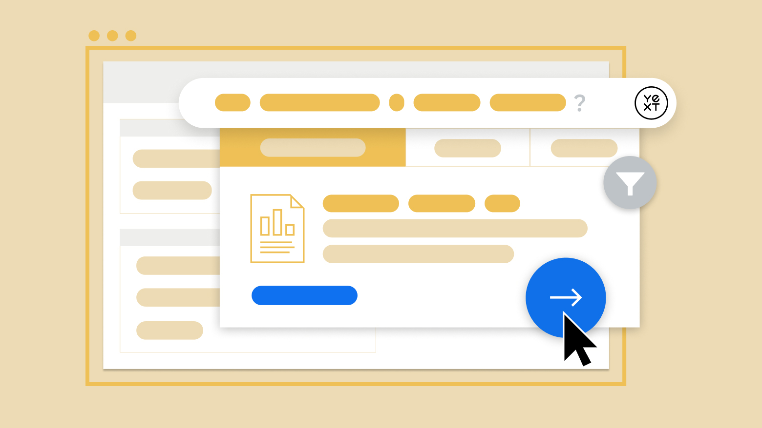
Yext walks through how to structure and organize a navbar to optimize your website and make it user-friendly.

Yext
Mar 1, 2022
A navbar, or navigation bar, is a powerful tool your users can utilize when searching for something on your site.
It is one of the essential best practices that allows your audience to browse your available services, products, or content in a focused way, and can be especially useful if they don't know exactly what they're looking for.
Search engines are fantastic for users that come to a site with something specific in mind, but navbars allow a little more flexibility.
Here's what to keep in mind when you're structuring your website and creating a navigation bar.
Why is a Website Navigation Menu Important?
Navigation on a website is a system that gives users the ability to quickly locate or search their browsers for what they're looking for.
Whether your company offers a service, a product, or general content, a primary navigation bar is crucial to your website and user experience. Almost all users report that navigation is extremely useful, up to 94%, and a site with poorly managed or nonexistent navigation won't hold their attention for very long.
Allowing your users to quickly find their objective boosts conversion rates- Even if they spend less time browsing around your website, the time that they save looking for what they want will give them a positive experience that they're likely to share with others.
Navigation can take several different forms. It could be a drop-down navigation bar in the header, an internal search engine that utilizes AI to analyze user queries, or a sitemap with all of the topics your webpage covers.
Today we'll focus on the website navigation bar, and how you can structure and organize it to fit your user's needs.
Different Types of Navbar
When managing your website and implementing a navbar, there are a few options to keep in mind. While they're all beneficial to your users and the organization of your webpage, each has particular strengths.
It will depend on what kind of site you have and the amount of content on it which navigation bar will work best for you and your users.
Horizontal
A horizontal navigation bar is what might come to mind first when you generally think of one. It presents links to different categories or sections within the website from right to left within the width of the header on your pages.
While these menu items don't typically dropdown (that would be a different type of navbar) a horizontal bar can take users to the general corners of your website to help narrow down their search.
Vertical
The functionality of the vertical navigation bar is the same as the horizontal; the menu labels cover general subjects that would be found on your website. The difference is that, instead of left to right, they're organized from top to bottom. This type of menu is also called a sidebar.
You would usually place a navbar like this on the left side of your page. Though they work the same as horizontal bars, you're able to write more on a vertical than you might a horizontal. It also gives your page a small, unique quality as they aren't as common.
Dropdown
Down menus are more dense versions of the horizontal or vertical bars. Initially, they present similar information, general areas of your website.
But when the user chooses to float or clicks on a button, they drop down an extended menu with more tab options to narrow your search. Dropdown navigation bars are an excellent choice for websites full of content to scroll as they can offer a more focused scope of your available information.
Hamburger Menu
Hamburger navigation bars are common on mobile layouts more than desktops, mostly because they save space on smaller devices.
The "hamburger" element of this design is an optional dropdown menu with more information, allowing the user to choose how much content is available at a given time. Because mobile devices have limited screen real estate this can be extremely useful.
Mobile devices account for more than half of all internet traffic, so making sure that your website's organization and usability are optimized for smartphones is crucial to a successful business with today's technology.
Footer
Footer navbars tend to be more expanded than horizontal bars, but they follow the same function. They live at the bottom of your web page and allow users to quickly browse all of the menu options at once.
But because they're located in the footer, they don't clutter up the layout and distract the user.
How to Phrase Your Navigational Categories
There are plenty of different ways to organize your navigation bar, and there are also ways to consider phrasing the categories within it. Identify your business and what you're providing to your users and then consider one of these phrasing options.
While they all might work fine for your audience, some will be a better fit depending on what it is you offer.
Object
Object-based organization in your navbar is generally a useful way to go, especially if your business is providing a product. Object phrasing relies on nouns to depict the categories and sub-categories.
For example, if your business were to sell plants, your navbar might have options including specific plant names, plant accessories or lights, all object-based identifiers.
Action
Action-based navigation can also be helpful if you provide one or more services to your audience. These are pages on which you do specific things.
Take for instance you run a home improvement business, you could have navbar options like "Construction" "Cleaning" "Landscaping" or "Quotes."
Audience
Audience-based menu options can be another great organizational style for certain businesses. These address particular users by who they are and what they do.
Imagine you run a shoe store, you could have a navbar that offers products for cyclists, runners, or hikers.
Tips for Navbar Management
As we've discussed, a navbar is an extremely useful organizational tool for your users when it comes to swiftly moving around your site.
Whether you decide to implement a vertical, horizontal, or dropdown menu style bar, there are some general but essential points to keep in mind.
Focus on Consistency
However, you choose to structure your navbar, whether horizontal, vertical, dropdown, or hamburger, make sure that you stay consistent throughout the entire page.
The navbar should always remain a familiar place to your users so that they may find their way around your site. Font, layout, and structure are all critical elements that your users will expect to know after using the navigation bar once.
If any of these change throughout their experience they might get unnecessarily distracted and confused.
Optimize for Every Device
As we mentioned, more and more users are accessing the internet on mobile devices every year.
With all of the content available on the internet, you want to make sure your website is optimized for all platforms. If users come across your page on their phone but it isn't structured properly they're likely to move on to someone else who is.
Prioritize Your Information
While not all of your content is going to be equally accessible, you should try to identify what your users are looking for most and keep it in mind when shaping your layout.
Using traffic data to follow your users' visits, make sure that your most popular content is easily available and even highlighted. While users will spend the time they have to get somewhere, it always helps to speed up that process for them.
Use Breadcrumbs
Breadcrumbs are a great way to provide backward navigation to your users. You've probably seen them before — a string of pages that you've been to in order of sub-categories that lets you backtrack to more general topics if you've gone down the wrong path.
For example, imagine that you're looking for a specific phone case on a popular electronics store website, the breadcrumb trail might look like this:
Company site > Cell Phones > Accessories > iPhone Accessories > Cases
The breadcrumb trail allows users to back up to accessories easily if they decide they want to look for other products.
In Conclusion
Navigation is critical in web design to provide a positive experience to your visitors. Poorly constructed and difficult to use websites will have your potential audience turning away and seeking out competitors, which is obviously not what we want.
Navigation bars are an excellent way to provide inline directions to your users. While some may visit your business page already knowing exactly what they want and what it's called, others may just have a general idea or need the inspiration for what they're looking for.
A well-organized navbar allows users to narrow down their search category by category. With relevant and helpful category phrasing and optimized channels of navigation, the navbar is a great way to guide your users through your content.
References:
6 Website Features People Value | Clutch.co
Customer Experience Statistics | Superoffice.com
Share of Website traffic coming from mobile devices | Statista.com