The 4 Stages Of Search Denial

If almost every customer that arrives at your site got there via search, why do we then assume that they don’t want to continue their journey with search?

By Christian J. Ward

Jul 20, 2023

5 min

Customer experience (CX) has become one of the most critical transformation paths for business. The CXO title is also one of the fastest-growing executive leadership positions I've seen in the last five years, which is a welcomed trend. For every company, the ability to step back and reevaluate your digital experience takes both courage and humility. Two traits that merge to both challenge "the way it has always been done" and the difficult, and often humbling, experience that always occurs when you honestly view your own digital experiences through the customer's perspective.

Unfortunately, this process can often be painful, resulting in a malady of sorts that permeates many organizations: Search Denial (SD).

The first thing to recognize about SD is that it is paradoxical. We, as companies and brands, have spent the last twenty years optimizing our content, brands, data, and digital information to hopefully show up in the search results of a consumer's journey.

And yet, the moment we show up in those results, what do we all do? We drop the customer onto a website with no search or a terrible search experience.

If virtually every single customer that arrives at your site or digital experience got there via search, why do we then assume that they don't want to continue their journey with search?

And therein lies Search Denial.

The paradox is that most organizations spend a drastic amount of time and resources to show up in search and almost no time powering search on their own digital experiences.

How do you know if you're plagued by this affliction? Let's run through the four common stages that make up the path from denial to enlightenment.

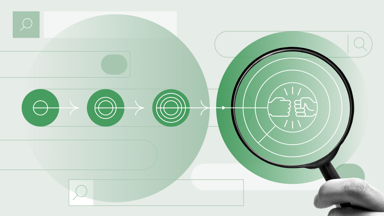
You deny the existence of search functionality altogether. There is no search bar on your website or digital experiences, and you are convinced there's no need for it.

Your site is a maze of drop-down menus that perfectly conform to Conway's Law. Every time a new product, service, or department exists, you have six meetings to figure out where and on which drop-down menu it should appear. You believe that the data from click paths is the perfect demonstration of a consumer's intent because that same click data confirms your brilliant segmentation strategy (confirmation bias).

Did our hunter-gatherer ancestors not survive for tens of thousands of years roaming the wilderness to track down what they needed? Have modern humans grown so pampered that they can't spend just a few minutes navigating the dropdown menu jungle you've created? Of course not. "Search is a superfluous luxury of modernity," you mutter to yourself as you hurriedly scroll past the bounce metrics on the monthly traffic reports while you head to the critical SEO team meeting.

Stage 2: the tiny magnifying glass

Your website has search. Sure, it may not be "reliable" or "effective," but it's definitely there. See, there's the magnifying glass icon in the far right corner, just large enough to make out if you squint and tilt your head at the right angle.

People will find it there, you assure yourself. It's only that small because we don't want to crowd the drop-down menu options. That's called design aesthetics. Just yesterday your irksome colleague had the nerve to imply you're just trying to hide the icon, praying no one will actually use the outdated search function. You like to point out that "no one really uses our search anyway" confirming this again with site statistics that prove no one ever hits that search bar (survivorship bias).

Fine, you put a proper search bar on the site. But only because your clients kept sending nagging requests for it. And because it comes up in every UX survey you've put out in the past five years. And because your boss finally told you to make it happen.

Sure, your internal IT experts tell you the core search functionality "still sucks," but that's why you made the bar like one eighth the size of a Google search bar. That way most visitors won't actually use it.

You have to admit though, the whole customers-having-answers-at-their-fingertips thing is a pretty cool idea. Maybe your customers don't actually care about that perfect dropdown menu, the years of A/B testing, or the countless internal bureaucracy debates. Maybe, just maybe, using cookies and creepy tracking technology to guess what a customer wants isn't the way to go. Could those crazy data privacy people have a point?

You catch yourself and give your head a vigorous shake. You've been reading too many news articles.

Stage 4: search as a primary customer experience

You've given in.

The search bar now dominates your homepage and every other page of your site. Heck, there's even a scrolling marquee that encourages people to try it because it's so good. Taking a cue from the folks at Amazon, Google, Facebook, Instagram, and Airbnb, you stretched the search bar across a previously unfathomable one-third of the viewable space on desktop — and 90 percent on mobile.

You marvel at the amount and quality of zero-party data being shared — willingly — by customers using the search function. They're telling you exactly what they're looking for, which lets you truly personalize each of their experiences. And you don't even need cookies and tracking tech.

Your engagement is up. Your conversions are up. Every day you're greeted with a search query report that tells you what new content to create and how you can better help customers on their journey to conversion. Search has shifted the conversation on your website from a monologue to a dialogue.

You sit back, marveling at the transformation. With conversational AI on the rise, you realize, this is just the beginning.

Ready to learn more about innovating with AI? Click here to read our guide.

Share this Article

Read Next

loading icon